Analyze NYC Collision Data
/ 17 min read
Peak Times for Traffic Related Casualties in New York City
Using Python, Pandas, Jupyter Notebooks and Matplotlib to extract useful information about NYC traffic casualties.
What month of the year? …what day of the week? …what time of day? has the most human casualties on New York’s streets?
I’ve spent considerable time walking, biking, driving and taking public transport in this busy city. Just like many New Yorkers, I’ve also had numerous close calls with vehicles while crossing wide streets, where traffic turns onto the crossing lane as you try to make it to the other side in one piece.
Using the information provided by NYC Open Data, I wanted to find out when most human casualty causing collisions occur, and how I could best present that information.
Skip the explanations and go straight to the results
Read on to see how I came up with these numbers.
Technology Used
The Setup
import datetimefrom pathlib import Pathimport matplotlib.pyplot as pltimport numpy as npimport pandas as pdimport seaborn as snsData Formatting Functions
def empty_to_zero(val): """Converts empty values to 0""" val = val.strip("\s+") return val if len(val) else 0
def convert_to_numeric(df, column_list): """Given a list of DataFrame columns, it converts the empty values to zero""" df[column_list] = df[column_list].apply(pd.to_numeric, errors="coerce")Setup Global Variables
# This is a list of the dataset columns that I want to use.# I'm omitting some fields not necessary for this study. These include:# longitude, latitude, the vehicle types as well as crash contributing factors.cols_requested = [ "COLLISION_ID", "CRASH DATE", "CRASH TIME", "BOROUGH", "ZIP CODE", "LOCATION", "ON STREET NAME", "CROSS STREET NAME", "OFF STREET NAME", "NUMBER OF PERSONS INJURED", "NUMBER OF PERSONS KILLED", "NUMBER OF PEDESTRIANS INJURED", "NUMBER OF PEDESTRIANS KILLED", "NUMBER OF CYCLIST INJURED", "NUMBER OF CYCLIST KILLED", "NUMBER OF MOTORIST INJURED", "NUMBER OF MOTORIST KILLED",]
# This dictionary will be used to ensure that the colums are of the expected data typecrash_dtypes = { "CRASH DATE": str, "CRASH TIME": str, "BOROUGH": str, "ZIP CODE": str, "LOCATION": str, "ON STREET NAME": str, "CROSS STREET NAME": str, "OFF STREET NAME": str,}
# New column names that contain numeric valuesnumeric_cols = [ "NUM_PERSONS_INJURED", "NUM_PERSONS_KILLED", "NUM_PEDESTRIANS_INJURED", "NUM_PEDESTRIANS_KILLED", "NUM_CYCLISTS_INJURED", "NUM_CYCLISTS_KILLED", "NUM_MOTORISTS_INJURED", "NUM_MOTORISTS_KILLED",]
# These 4 victim categories are supplied by the NYPDvictim_categories = ["person", "cyclist", "motorist", "pedestrian"]# 'person' status should be a combination of the other three categories# TODO Verify the relationship between 'person' and the other three categoriesManipulation Dictionaries
#To give columns shorter more meaningful namescols_rename = { "CRASH DATE": "DATE", "CRASH TIME": "TIME", "ZIP CODE": "ZIP_CODE", "ON STREET NAME": "ON_STREET_NAME", "CROSS STREET NAME": "CROSS_STREET_NAME", "OFF STREET NAME": "OFF_STREET_NAME", "NUMBER OF PERSONS INJURED": "NUM_PERSONS_INJURED", "NUMBER OF PERSONS KILLED": "NUM_PERSONS_KILLED", "NUMBER OF PEDESTRIANS INJURED": "NUM_PEDESTRIANS_INJURED", "NUMBER OF PEDESTRIANS KILLED": "NUM_PEDESTRIANS_KILLED", "NUMBER OF CYCLIST INJURED": "NUM_CYCLISTS_INJURED", "NUMBER OF CYCLIST KILLED": "NUM_CYCLISTS_KILLED", "NUMBER OF MOTORIST INJURED": "NUM_MOTORISTS_INJURED", "NUMBER OF MOTORIST KILLED": "NUM_MOTORISTS_KILLED",}
# DataFrame columns whose empty values will be converted to zero# Using the 'empty_to_zero' function, defined earlier.convert_cols = { "NUMBER OF PERSONS INJURED": empty_to_zero, "NUMBER OF PERSONS KILLED": empty_to_zero, "NUMBER OF PEDESTRIANS INJURED": empty_to_zero, "NUMBER OF PEDESTRIANS KILLED": empty_to_zero, "NUMBER OF CYCLIST INJURED": empty_to_zero, "NUMBER OF CYCLIST KILLED": empty_to_zero, "NUMBER OF MOTORIST INJURED": empty_to_zero, "NUMBER OF MOTORIST KILLED": empty_to_zero,}More Meaningful Names Used by the Charts
# An ordered list of 'day' names to be used in some charts.day_names_order = [ "Monday", "Tuesday", "Wednesday", "Thursday", "Friday", "Saturday", "Sunday",]
# Day name abbreviations for chartsday_abbr_order = [d[0:3] for d in day_names_order]
# Month names in sequencemonth_names_order = [ "January", "February", "March", "April", "May", "June", "July", "August", "September", "October", "November", "December",]
# Month name abbreviations for chartsmonth_abbr_order = [m[0:3] for m in month_names_order]Chart Variables
# Chart colors.# These are the Matplotlib 'Tableau' color names.bar_colors = [ "tab:blue", "tab:orange", "tab:green", "tab:red", "tab:purple", "tab:brown", "tab:pink", "tab:gray", "tab:olive", "tab:cyan",]
# Chart color codesbase_colors = ["b", "g", "r", "c", "m", "y", "k", "w"]
# matplotlib.pyplot Chart Colorscolor = "k"plt.rcParams["text.color"] = colorplt.rcParams["axes.labelcolor"] = colorplt.rcParams["xtick.color"] = "b"plt.rcParams["ytick.color"] = "b"
First Action
Read in the Raw NYPD Collision Data to ‘crash’ DataFrame
The NYC collision data CSV file: CSV file
Some of the data is cleaned and validated using dictionaries and lists defined earlier.
collision_filename = "motor_vehicle_collisions_sep08_2023.csv"
# Use the Pandas 'read_csv' functioncrash = pd.read_csv(    Path.cwd().joinpath("..").joinpath(collision_filename),    index_col="COLLISION_ID",    usecols=cols_requested,    dtype=crash_dtypes,    converters=convert_cols,)
Rename some of the DataFrame columns
# Save the original column namesoriginal_col_names = crash.columns.to_list()
# Use the 'cols_rename' list of new namescrash.rename(columns=cols_rename, inplace=True)
print("Original Crash Column Names\n{}".format(original_col_names))print("\nRenamed Crash Columns Names\n{}".format(crash.columns.to_list()))
['CRASH DATE', 'CRASH TIME', 'BOROUGH', 'ZIP CODE', 'LOCATION', 'ON STREET NAME', 'CROSS STREET NAME', 'OFF STREET NAME', 'NUMBER OF PERSONS INJURED', 'NUMBER OF PERSONS KILLED', 'NUMBER OF PEDESTRIANS INJURED', 'NUMBER OF PEDESTRIANS KILLED', 'NUMBER OF CYCLIST INJURED', 'NUMBER OF CYCLIST KILLED', 'NUMBER OF MOTORIST INJURED', 'NUMBER OF MOTORIST KILLED']
['DATE', 'TIME', 'BOROUGH', 'ZIP_CODE', 'LOCATION', 'ON_STREET_NAME', 'CROSS_STREET_NAME', 'OFF_STREET_NAME', 'NUM_PERSONS_INJURED', 'NUM_PERSONS_KILLED', 'NUM_PEDESTRIANS_INJURED', 'NUM_PEDESTRIANS_KILLED', 'NUM_CYCLISTS_INJURED', 'NUM_CYCLISTS_KILLED', 'NUM_MOTORISTS_INJURED', 'NUM_MOTORISTS_KILLED']Convert Selected Column String values to Numeric
# The 'numeric_cols' list and 'convert_to_numeric' function are defined earlierconvert_to_numeric(crash, numeric_cols)The DataSet Row and Column Count
crash.shape(2023617, 16)An Overview of the Dataset
crash.info()Index: 2023617 entries, 4455765 to 4631311Data columns (total 16 columns):# Column Dtype--- ------ -----0 DATE object1 TIME object2 BOROUGH object3 ZIP_CODE object4 LOCATION object5 ON_STREET_NAME object6 CROSS_STREET_NAME object7 OFF_STREET_NAME object8 NUM_PERSONS_INJURED int649 NUM_PERSONS_KILLED int6410 NUM_PEDESTRIANS_INJURED int6411 NUM_PEDESTRIANS_KILLED int6412 NUM_CYCLISTS_INJURED int6413 NUM_CYCLISTS_KILLED int6414 NUM_MOTORISTS_INJURED int6415 NUM_MOTORISTS_KILLED int64dtypes: int64(8), object(8)memory usage: 262.5+ MBThe dataset in table format using ‘describe()’
# 'set_option' is used to display numeric values as a 'float' rather# than the default 'scientific notation'pd.set_option("display.float_format", lambda x: "%8.2f" % x)crash.describe()| NUM_PERSONS_INJURED | NUM_PERSONS_KILLED | NUM_PEDESTRIANS_INJURED | NUM_PEDESTRIANS_KILLED | NUM_CYCLISTS_INJURED | NUM_CYCLISTS_KILLED | NUM_MOTORISTS_INJURED | NUM_MOTORISTS_KILLED | |
|---|---|---|---|---|---|---|---|---|
| count | 2023617.00 | 2023617.00 | 2023617.00 | 2023617.00 | 2023617.00 | 2023617.00 | 2023617.00 | 2023617.00 |
| mean | 0.30 | 0.00 | 0.06 | 0.00 | 0.03 | 0.00 | 0.22 | 0.00 |
| std | 0.69 | 0.04 | 0.24 | 0.03 | 0.16 | 0.01 | 0.66 | 0.03 |
| min | 0.00 | 0.00 | 0.00 | 0.00 | 0.00 | 0.00 | 0.00 | 0.00 |
| 25% | 0.00 | 0.00 | 0.00 | 0.00 | 0.00 | 0.00 | 0.00 | 0.00 |
| 50% | 0.00 | 0.00 | 0.00 | 0.00 | 0.00 | 0.00 | 0.00 | 0.00 |
| 75% | 0.00 | 0.00 | 0.00 | 0.00 | 0.00 | 0.00 | 0.00 | 0.00 |
| max | 43.00 | 8.00 | 27.00 | 6.00 | 4.00 | 2.00 | 43.00 | 5.00 |
- count - There are over 2M rows of data
- max - NUM_PERSONS_INJURED in one collision is 43
- mean - NUM_PERSONS_INJURED per collision is 0.3
- Thats almost 1 injury for every three collisions
- More on the pandas.DataFrame.describe function here
Merge the ‘DATE’ and ‘TIME’ columns into one ‘DATE’ column
The original ‘DATE’ is a ‘date only’ field without the time. After merging the date and time columns, convert ‘DATE’ to a Python “datetime” object. Then remove the now unnecessary ‘TIME’ column.
# Mergecrash["DATE"] = pd.to_datetime(crash["DATE"] + " " + crash["TIME"])# Remove the 'TIME' columncrash.drop(columns=["TIME"], inplace=True)# Convert to Python 'datetime'crash["DATE"] = pd.to_datetime(crash["DATE"])Some information about the ‘DATE’ column
crash["DATE"].describe()count 2023617mean 2017-05-20 19:34:04.983196928min 2012-07-01 00:05:0025% 2014-12-22 14:30:0050% 2017-04-03 09:05:0075% 2019-06-17 03:55:00max 2023-09-05 23:40:00Name: DATE, dtype: object- min - The first collision record was on July 8, 2012
- max - The last record for this DataSet is September 05, 2023
Create ‘start_date’ and ‘end_date’ variables
# 'start_date' and 'end_date' are used in the chartsstart_date = crash["DATE"].dt.date.min()end_date = crash["DATE"].dt.date.max()print("Start Date: {0} - End Date: {1}".format(start_date, end_date))Start Date: 2012-07-01 - End Date: 2023-09-05- Start Date: - 2012-07-01
- End Date: - 2023-09-05
The Unknown Borough Dilemma
The BOROUGH column should contain one of the 5 boroughs of New York City, BROOKLYN, BRONX, MANHATTAN, QUEENS and STATEN ISLAND.
Unfortunately, many of the ‘BOROUGH’ fields are empty, as the NYPD don’t record it in certain situations.
For example, if the collision occurred on one of the main bridges between boroughs, or if the collision occurred on any one of NYC’s many expressways or parkways.
Further investigation would be needed to confirm this.
I previously reached out to the open data team for more information on this, but got no reply.
Replace empty ‘BOROUGH’ values with ‘UNKNOWN’
crash.fillna(value={"BOROUGH": "UNKNOWN"}, inplace=True)The ‘BOROUGH’ Column
crash["BOROUGH"].describe()count 2023617unique 6top UNKNOWNfreq 629528Name: BOROUGH, dtype: object- count - There are 2023617 rows of data in the dataset
- unique - 6 unique borough names including, ‘UNKNOWN’
- top - ‘UNKNOWN’ is the most frequent borough recorded
- freq - There are 629528 occurrances of the ‘UNKNOWN’ borough
# Display the unique borough namescrash['BOROUGH'].unique()array(['UNKNOWN', 'BROOKLYN', 'BRONX', 'MANHATTAN', 'QUEENS', 'STATEN ISLAND'], dtype=object)The ‘ZIP_CODE’ Column
# Replace empty ZIP_CODE's with 'UNKNOWN'crash.fillna(value={'ZIP_CODE': 'UNKNOWN'}, inplace=True)The Unknown Zip Code Dilemma
As with the ‘BOROUGH’ column, the postal ZIP_CODE is often left empty.
Replace Zip Codes with ‘UNKNOWN’.
crash["ZIP_CODE"].describe()count 2023617unique 235top UNKNOWNfreq 629767Name: ZIP_CODE, dtype: object- top - ‘UNKNOWN’ is the Zip Code with the most collisions.
- TODO: Get the actual ZIP_CODE with the most collisions.
- freq - 629767 collisions for this zip code.
- unique - 234 NYC zip codes with recorded collisions in the dataset.
matplotlib.pyplot Chart of Crash Injuries by Borough
persons_injured_by_borough = crash.groupby(by=["BOROUGH"])["NUM_PERSONS_INJURED"].sum()boroughs = persons_injured_by_borough.index
width = 0.9y_pos = np.arange(len(persons_injured_by_borough))x_pos = np.arange(len(boroughs))inj_bars = plt.bar(y_pos, persons_injured_by_borough, width, color=bar_colors)
plt.bar_label(inj_bars, label_type="center", fmt="%d")plt.xticks(x_pos, boroughs)plt.title("Crash Injuries by Borough From {0} to {1}".format(start_date, end_date))plt.xlabel("Borough")plt.ylabel("Injured Count")plt.xticks(rotation=315)plt.show()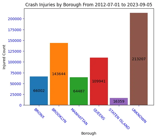
Chart of Crash Deaths by Borough
persons_killed_by_borough = crash.groupby(by=["BOROUGH"])["NUM_PERSONS_KILLED"].sum()
boroughs = persons_killed_by_borough.indexwidth = 0.9y_pos = np.arange(len(persons_killed_by_borough))x_pos = np.arange(len(boroughs))k_bars = plt.bar(y_pos, persons_killed_by_borough, width, color=bar_colors)
plt.bar_label(k_bars, label_type="center", fmt="%d")plt.xticks(x_pos, boroughs)plt.title("Crash Deaths by Borough From {0} to {1}".format(start_date, end_date))plt.ylabel("Death Count")plt.xticks(rotation=315)
plt.show()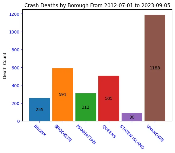
Borough Chart Results
Brooklyn leads the city in crash deaths and injuries. The “UNKNOWN” borough has is the highest total overall. Unfortunately, we don’t know where those collisions should be. We could guess that they occured on one of the many bridges and expressways across NYC. A future project may be to find the borough based on the ‘ZIP_CODE’, ‘LOCATION’ or street address if available.
Create New Time Period Columns and Lists
New Columns: YEAR, MONTH_NAME, DAY_NAME and HOUR
# Extract information from the DATE columncrash["YEAR"] = crash["DATE"].dt.year
# Remove 2012 as it only has 6 months of datano_2012_mask = crash["YEAR"] > 2012crash = crash[no_2012_mask]
# Reset the start_date variable to reflect the changestart_date = crash["DATE"].dt.date.min()year_order = crash["YEAR"].sort_values().unique()
# Create a MONTH_NAME column using the first 3 characters of eachcrash["MONTH_NAME"] = crash["DATE"].dt.month_name().str[0:3]
# Create a HOUR column. This is the hour of day that the collision occurredcrash["HOUR"] = crash["DATE"].dt.strftime("%H")
# Convert 'hour_order' to a Python list instead of Numpy arrayhour_order = crash["HOUR"].sort_values().unique().tolist()
crash["DAY_NAME"] = crash["DATE"].dt.strftime("%a")
print("Year, Month and Hour sequenced lists will be used for charting.")print("Year order: {}\n".format(year_order))print("Month abbreviations: {}\n".format(crash.MONTH_NAME.unique()))print("Hour order: {}\n".format(hour_order)) Year, Month and Hour order lists will be used for charting. Year order: [2013 2014 2015 2016 2017 2018 2019 2020 2021 2022 2023]
Month abbreviations: ['Sep' 'Mar' 'Jun' 'Dec' 'Apr' 'Jul' 'Feb' 'Aug' 'Nov' 'May' 'Jan' 'Oct']
Hour order: ['00', '01', '02', '03', '04', '05', '06', '07', '08', '09', '10', '11', '12', '13', '14', '15', '16', '17', '18', '19', '20', '21', '22', '23']Chart the Yearly Collision Injuries and Deaths
An overview of the total deaths and injuries on NYC streets.
# These two variables will be used later on alsocrash_by_year_killed = (    crash.groupby("YEAR")["NUM_PERSONS_KILLED"].sum().sort_values(ascending=False))crash_by_year_injured = (    crash.groupby("YEAR")["NUM_PERSONS_INJURED"].sum().sort_values(ascending=False))
print("5 Worst Years for Collision Deaths")print(crash_by_year_killed.head(5))print("\n5 Worst Years for Collision Injuries")print(crash_by_year_injured.head(5))
    5 Worst Years for Collision Deaths    YEAR    2013    297    2021    296    2022    287    2020    269    2014    262    Name: NUM_PERSONS_KILLED, dtype: int64
    5 Worst Years for Collision Injuries    YEAR    2018    61941    2019    61389    2017    60656    2016    60317    2013    55128    Name: NUM_PERSONS_INJURED, dtype: int64
Chart the Yearly Collision Deaths and Injuries
### Setup the matplotlib.pyplot bar chart
killed_injured = {    "Killed": crash_by_year_killed.loc[year_order],    "Injured": crash_by_year_injured.loc[year_order],}
x_loc = np.arange(len(year_order))  # the label locationswidth = 0.45  # the width of the barsmultiplier = 0fig, ax = plt.subplots(figsize=(10, 15), layout="constrained")
# Create Injured and Killed bars for each yearfor killed_or_injured, count in killed_injured.items():    offset = width * multiplier    rects = ax.bar(x_loc + offset, count, width, label=killed_or_injured)    ax.bar_label(rects, padding=3)    multiplier += 1
# Add some text for labels, title and custom x-axis tick labels, etc.ax.set_xlabel("Year", fontsize=14)ax.set_ylabel("Killed/Injured Count", fontsize=14)ax.set_title(    "Persons Killed and Injured From {0} to {1}".format(start_date, end_date),    fontsize=20,)ax.set_xticks(x_loc + (width / 2), year_order)ax.legend(loc="upper left")ax.set_yscale("log")plt.show()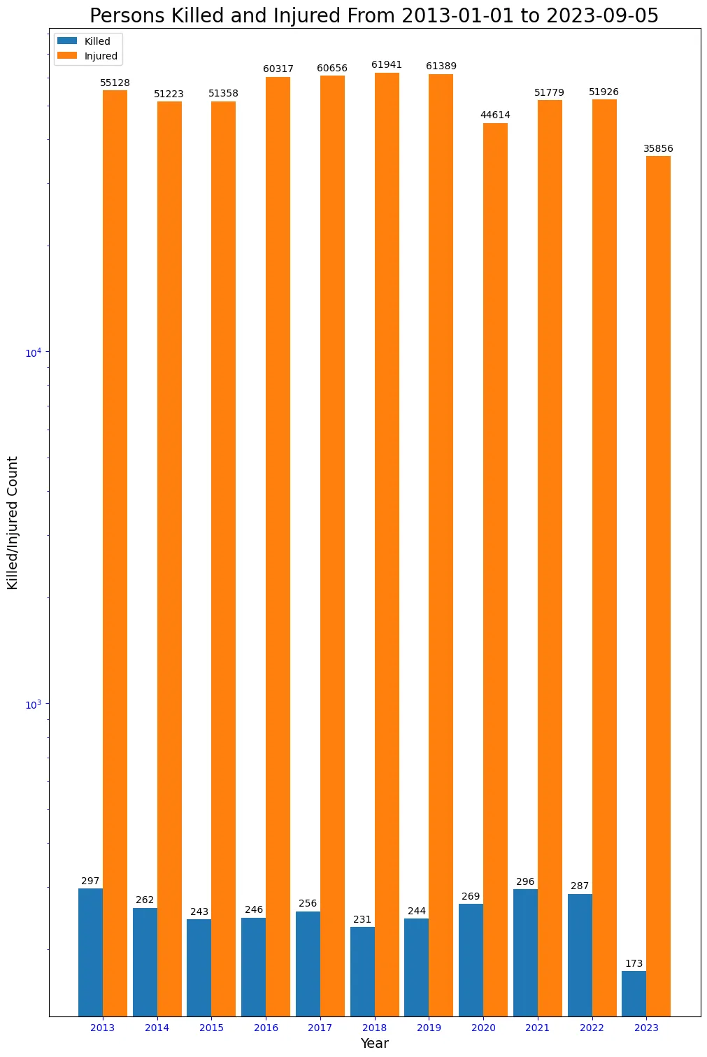
Collision Injuries and Deaths since 2013
Traffic fatalities had a general downward trend from the high of 297 in 2013 to a low of 231 in 2018. The trend is upwards from 2019 to 2021, which was just 1 fatality off the worst year, 2013. Traffic injuries were highest from 2016 to 2019. The following years are a slight improvement, but no visible downward trend yet.
Create a ‘CASUALTIES’ column with combined Killed + Injured Counts
For each category, Person, Pedestrian, Cyclist and Motorist, the new ‘CASUALTY’ column will contain the combined Injured + Killed counts.
Casualty Columns: PERSON_CASUALTY_COUNT, PEDESTRIAN_CASUALTY_COUNT, CYCLIST_CASUALTY_COUNT and MOTORIST_CASUALTY_COUNT
crash["PERSON_CASUALTY_COUNT"] = crash.NUM_PERSONS_INJURED + crash.NUM_PERSONS_KILLEDcrash["PEDESTRIAN_CASUALTY_COUNT"] = (    crash.NUM_PEDESTRIANS_INJURED + crash.NUM_PEDESTRIANS_KILLED)
crash["CYCLIST_CASUALTY_COUNT"] = crash.NUM_CYCLISTS_INJURED + crash.NUM_CYCLISTS_KILLEDcrash["MOTORIST_CASUALTY_COUNT"] = (    crash.NUM_MOTORISTS_INJURED + crash.NUM_MOTORISTS_KILLED)
#TODO This should be || instead of &?killed_injured_mask = (crash.NUM_PERSONS_KILLED > 0) & (crash.NUM_PERSONS_INJURED > 0)
# Check that it looks goodcrash[killed_injured_mask][ ["NUM_PERSONS_KILLED", "NUM_PERSONS_INJURED", "PERSON_CASUALTY_COUNT"]]| NUM_PERSONS_KILLED | NUM_PERSONS_INJURED | PERSON_CASUALTY_COUNT | |
|---|---|---|---|
| COLLISION_ID | |||
| 4407693 | 1 | 4 | 5 |
| 4457151 | 1 | 1 | 2 |
| 4457192 | 1 | 2 | 3 |
| 4457191 | 1 | 3 | 4 |
| 4487497 | 1 | 1 | 2 |
| ... | ... | ... | ... |
| 4660101 | 1 | 4 | 5 |
| 4627379 | 3 | 1 | 4 |
| 4628608 | 1 | 1 | 2 |
| 4629782 | 1 | 2 | 3 |
| 4628944 | 1 | 2 | 3 |
672 rows × 3 columns
Create a Function to Show Chart Values
show_values:
A function to print value counts above or to the side of the Barchart bars.
This is based on a functiton I got from this very useful site, statology.org.
The original function.
# Function to print value counts above or to the side of barchart bars
def show_values(axs, orient="v", space=0.01):    def _single(ax):        if orient == "v":            for p in ax.patches:                _x = p.get_x() + p.get_width() / 2                _y = p.get_y() + p.get_height() + (p.get_height() * 0.01)                value = "{:6,.0f}".format(p.get_height())                ax.text(_x, _y, value, ha="center", fontsize=12)        elif orient == "h":            for p in ax.patches:                _x = p.get_x() + p.get_width() + float(space)                _y = p.get_y() + p.get_height() - (p.get_height() * 0.5)                value = "{:6,.0f}".format(p.get_width())                ax.text(_x, _y, value, ha="left", fontsize=12)
    if isinstance(axs, np.ndarray):        for idx, ax in np.ndenumerate(axs):            _single(ax)    else:        _single(axs)
Helper functions for creating multiple charts based on Grouped statistics
Statistics will be created for the following columns: PERSON_CASUALTY_COUNT, PEDESTRIAN_CASUALTY_COUNT, CYCLIST_CASUALTY_COUNT and MOTORIST_CASUALTY_COUNT
def create_grouped_casualty_data_by_category(    victim_categories, time_group="YEAR", order_list=None):    """    Create multiple Seaborn SubPlot charts based on:    PERSON_CASUALTY_COUNT, PEDESTRIAN_CASUALTY_COUNT, CYCLIST_CASUALTY_COUNT and MOTORIST_CASUALTY_COUNT    time_group can be 'HOUR', 'DAY_OF_WEEK', 'MONTH_NAME', 'YEAR'    """    time_group = time_group.upper()    all_casualty_data = []
    for category in victim_categories:        cat_upper = category.upper()        casualty_label = cat_upper + "_CASUALTY_COUNT"
        casualty_data = crash.groupby(by=[time_group], as_index=True).agg(            {casualty_label: "sum"}        )        if order_list and len(order_list):            casualty_data = casualty_data.loc[order_list]
        category_data = {            "category": category,            "casualty_label": casualty_label,            "casualty_data": casualty_data,        }
        all_casualty_data.append(category_data)    return all_casualty_data
def create_bar_plots_for_casualty_data(sns, axes, order_list, crash_victims_data):    for idx, category_data in enumerate(crash_victims_data):        xlabel = None        ylabel = None        # Casualty Chart        category_title = category_data["category"].title()        chart_title = "{0} Casualties".format(category_title)
        casualty_max = category_data["casualty_data"][            category_data["casualty_label"]        ].max()        casualty_values = category_data["casualty_data"][            category_data["casualty_label"]        ].to_list()        casualty_colors = [            "k" if (x >= casualty_max) else "tab:red" for x in casualty_values        ]        ax = axes[idx]        sns.barplot(            data=category_data["casualty_data"],            x=order_list,            order=order_list,            y=category_data["casualty_label"],            palette=casualty_colors,            ax=ax,        ).set(title=chart_title, xlabel=xlabel, ylabel=ylabel)        show_values(axes)
More global Matplotlib and Seaborn chart variables
title_fontsize = 20label_fontsize = 18# For spacing between charts on the same gridgridspec_kw = {"wspace": 0.1, "hspace": 0.1}sns.set_style("whitegrid")Charts of Crash Casualties by Year
# Using Seaborn Charting Librarycol_ct = 1# Create the outer figure boxfig, axes = plt.subplots(    4, col_ct, figsize=(15, 40), layout="constrained", gridspec_kw=gridspec_kw)fig.suptitle(    "Total Yearly Crash Casualties from {0} to {1} by Category".format(        start_date, end_date    ),    fontsize=title_fontsize,)fig.supxlabel("Year", fontsize=label_fontsize)fig.supylabel("Counts", fontsize=label_fontsize)
crash_casualty_data = create_grouped_casualty_data_by_category(    victim_categories, "year")create_bar_plots_for_casualty_data(sns, axes, year_order, crash_casualty_data)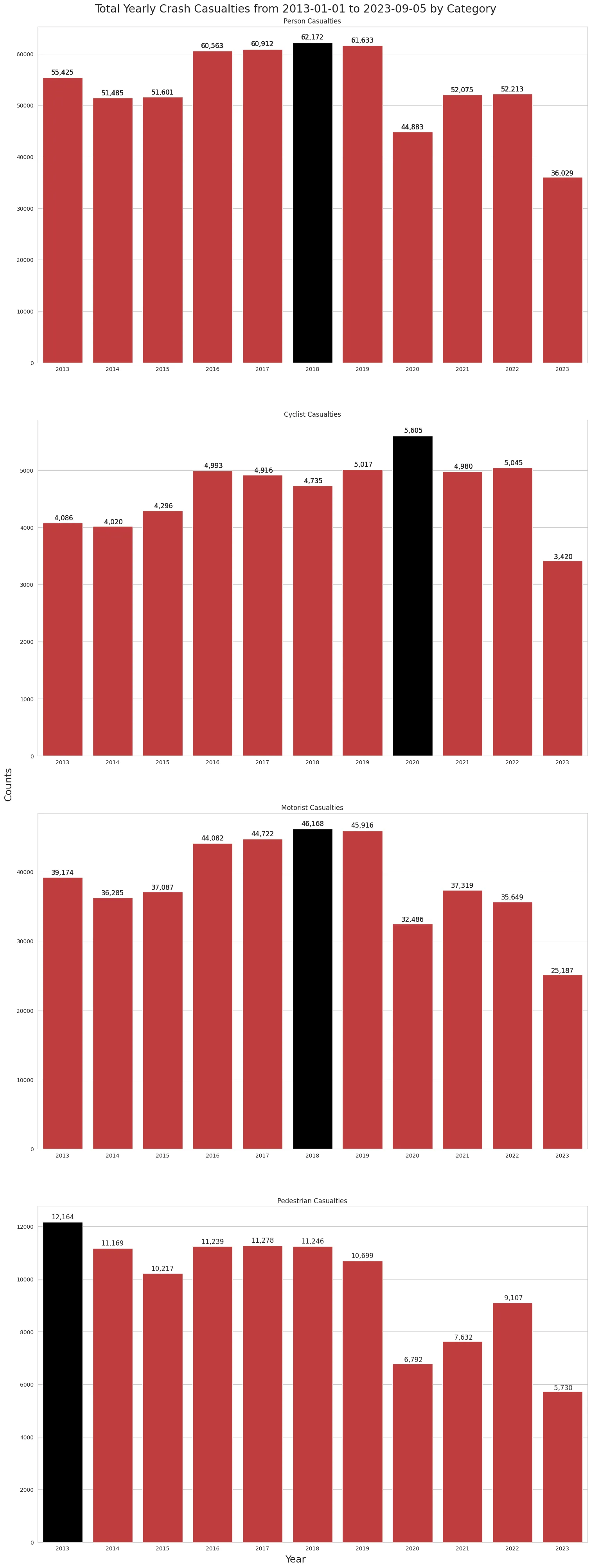
The Worst Year for Collision Casualties?
- 2018 was the worst for human casualties, with 62,172 injuries and deaths
- 2019 was a close second
- Followed by 2017 and 2016
- Cyclists - 2020 was by far the worst year with 5,605 casualties
- Motorists - 2018 was their worst year with 46,168 casualties
- Pedestrians - 2013 was their worst year with 12,164 casualties
- Things have improved a little for them since then.
Chart of Crash Casualties by Month
# Using Seaborn Charting Librarycol_ct = 1# Create the outer figure boxfig, axes = plt.subplots(    4, col_ct, figsize=(20, 30), layout="constrained", gridspec_kw=gridspec_kw)
fig.suptitle(    "Total Monthly Crash Casualties from {0} to {1} by Category".format(        start_date, end_date    ),    fontsize=title_fontsize,)fig.supxlabel("Month", fontsize=label_fontsize)fig.supylabel("Counts", fontsize=label_fontsize)
crash_casualty_data = create_grouped_casualty_data_by_category(    victim_categories, "month_name", month_abbr_order)create_bar_plots_for_casualty_data(sns, axes, month_abbr_order, crash_casualty_data)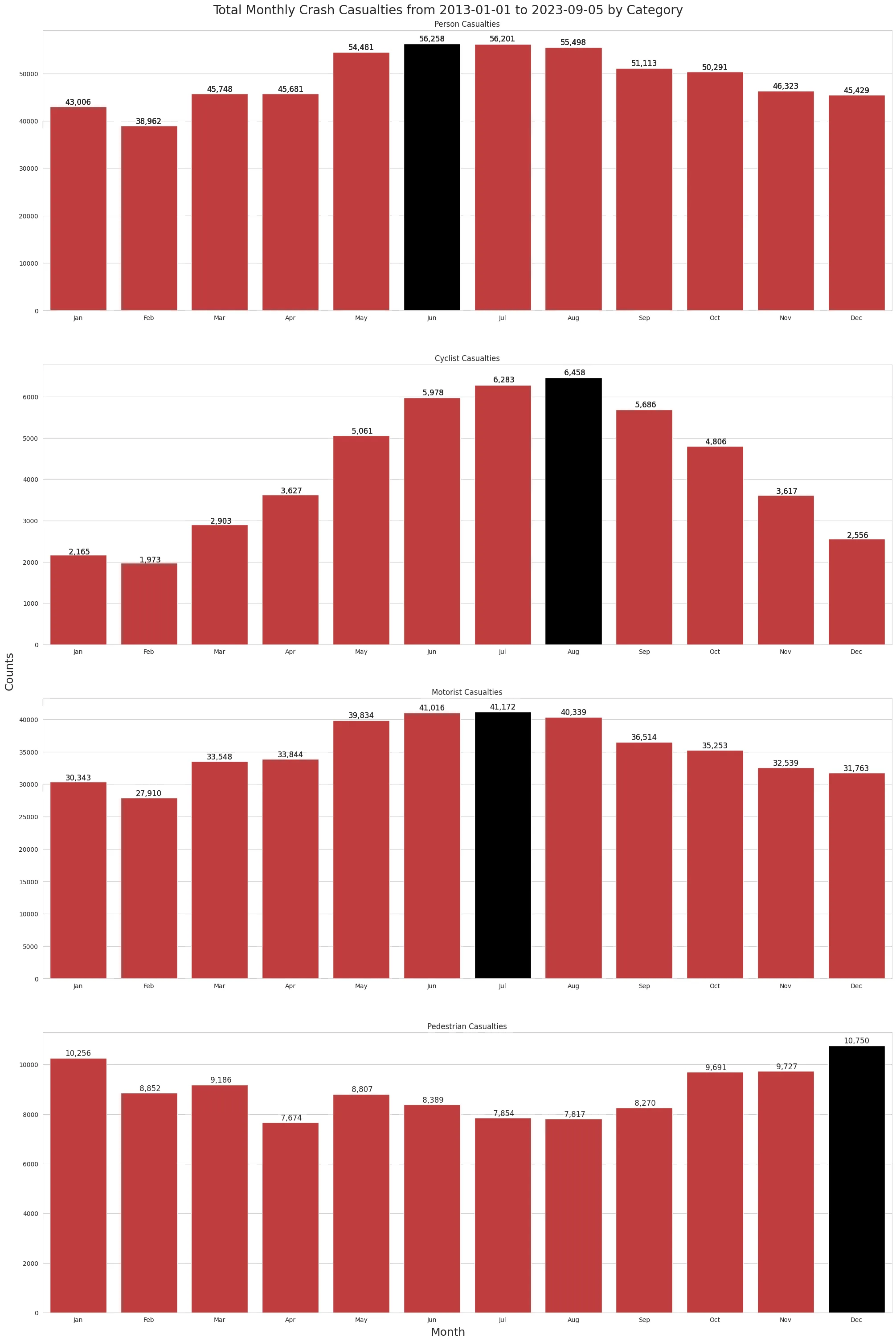
The Worst Month for Collision Casualties?
- June - Has been the worst month, with 56,240 injuries and deaths
- Summer months in general are bad for motorists and cyclists
- Winter is bad for pedestrians
- Cyclists - July has been the worst, with 6,270 casualties
- August and June follow after that.
- Motorists - July has been the worst, with 41,140 casualties
- June is a close second.
- Pedestrians - December has been the worst, with 10,750 casualties.
- January is a close second.
Chart of Crash Casualties by Day of Week
# Using Seaborn Charting Librarycol_ct = 1fig, axes = plt.subplots(    4, col_ct, figsize=(15, 40), layout="constrained", gridspec_kw=gridspec_kw)
fig.suptitle(    "Total Day of Week Crash Casualties from {0} to {1} by Category".format(        start_date, end_date    ),    fontsize=title_fontsize,)fig.supxlabel("Day of Week", fontsize=label_fontsize)fig.supylabel("Counts", fontsize=label_fontsize)
# crash.set_index('MONTH_NAME').loc[month_abbr_order].groupby(by=['MONTH_NAME']).agg({'PEDESTRIAN_CASUALTY_COUNT': 'sum'}).plot(kind='bar')crash_casualty_data = create_grouped_casualty_data_by_category(    victim_categories, "day_name", day_abbr_order)crash_casualty_datacreate_bar_plots_for_casualty_data(sns, axes, day_abbr_order, crash_casualty_data)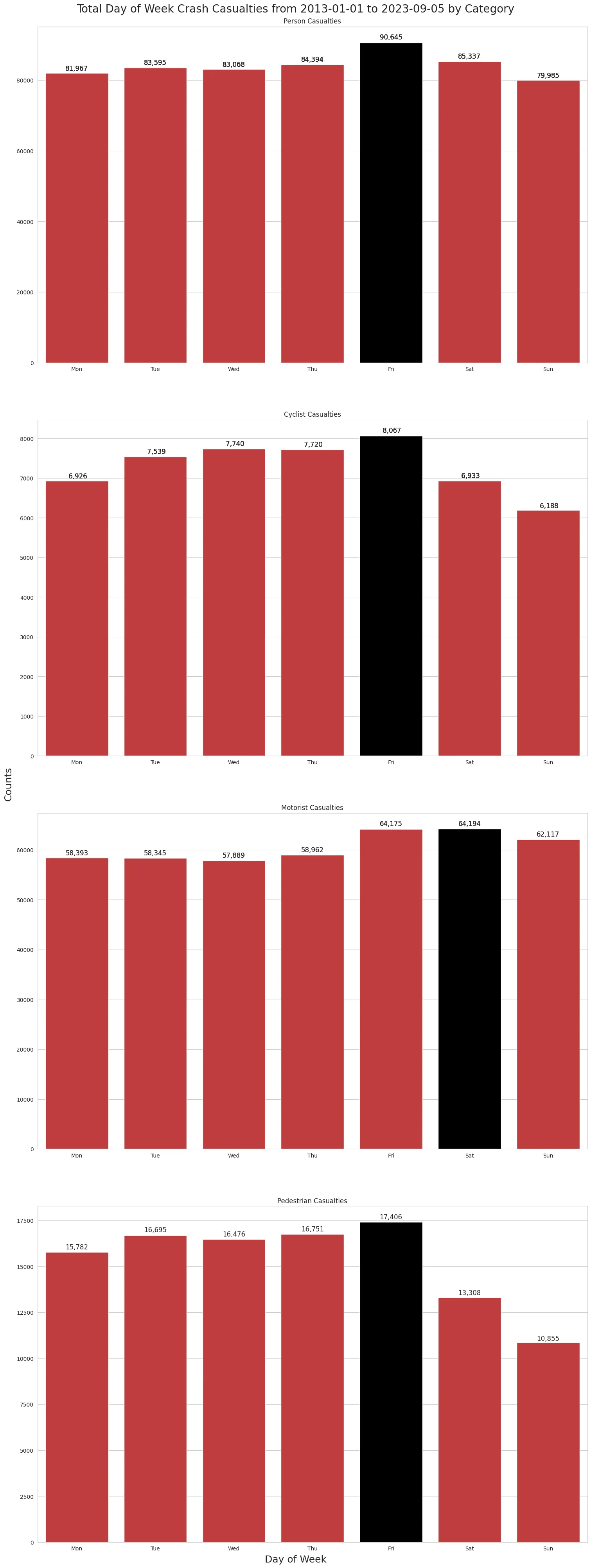
The Worst Day of the Week for Collision Casualties?
- Friday - Tends to be the worst day for human casualties with 90,089 injuries and deaths
- Sunday is the safest
- Cyclists - Friday is a bad day to bike in NYC, with 8,008 casualties since the start of 2013.
- Motorists - Friday and Saturday are equally bad, with 63,774 casualties each.
- Pedestrians - Should avoid Fridays, with 17,337 casualties since the start of 2013.
- Work from home
Chart of Crash Casualties by Hour of Day
# Using Seaborn Charting Librarycol_ct = 1#  Create the outer figure boxfig, axes = plt.subplots(    4, col_ct, figsize=(15, 40), layout="constrained", gridspec_kw=gridspec_kw)
fig.suptitle(    "Total Hour of Day Crash Casualties from {0} to {1} by Category".format(        start_date, end_date    ),    fontsize=title_fontsize,)fig.supxlabel("Hour of Day", fontsize=label_fontsize)fig.supylabel("Counts", fontsize=label_fontsize)
crash_casualty_data = create_grouped_casualty_data_by_category(    victim_categories, "hour", hour_order)
#  Create the inner chartscreate_bar_plots_for_casualty_data(sns, axes, hour_order, crash_casualty_data)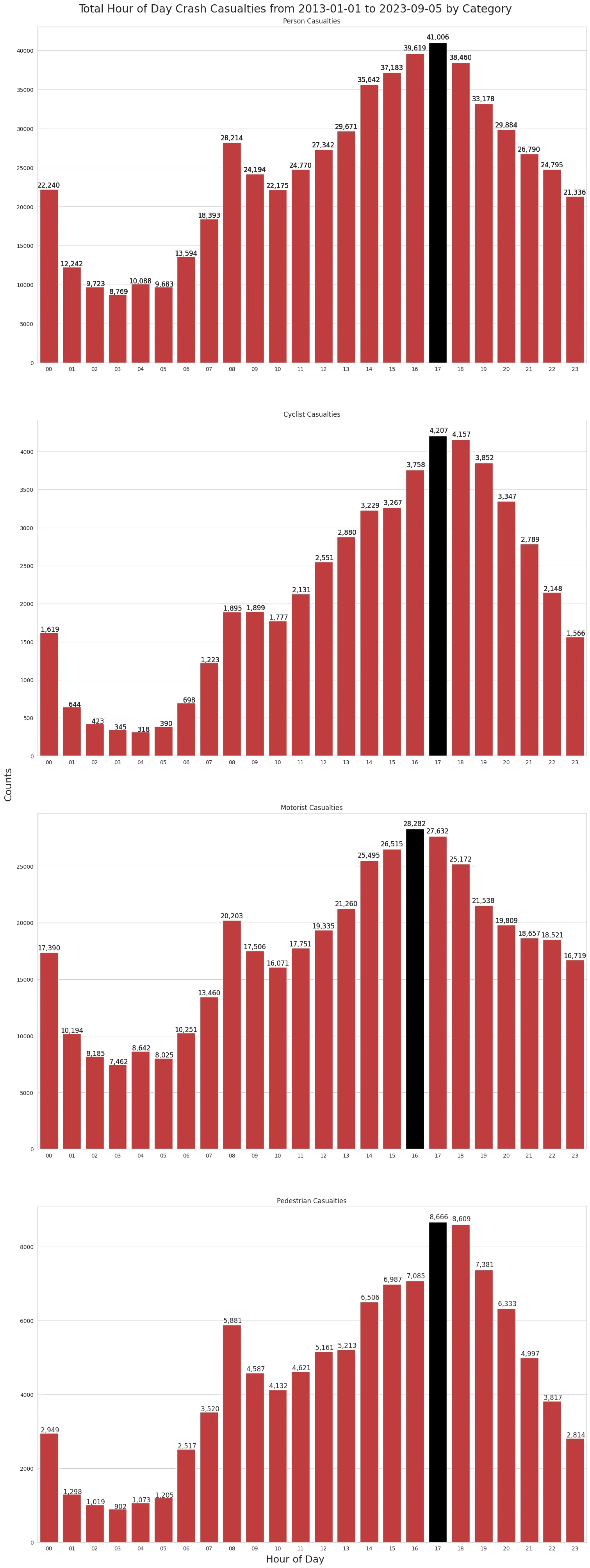
The Worst Hour of the Day for Collision Casualties?
- 5pm to 6pm - Is the worst time for human casualties, with 40,777 injuries and deaths
- Morning rush hour - Trends higher, but much lower than the evening rush-hour
- 12am to 1am - Has a high body count relative to its lower traffic volume
- Cyclists - Follows the trend with 4,167 casualties between 5 and 6 pm
- Motorists - Get off to an earlier start, with 28,142 casualties between 4 and 5 pm
- Pedestrians - Pedestrians get hit at higher rates between 5 and 6 pm
- 8,6623 casualties since the start of 2013
Conclusion
There are no major surprises with most of the data. Most injuries and deaths occur during the evening rush hour, when traffic volume is at its highest and people are in a rush to get home. This is particularly evident on Fridays, when the urge to get home seems to be the greatest.
I’m still curious as to why more motorist casualties on Saturday are almost equal to the Friday’s total. It could be because of Friday night “madness” or some other reason. I’d like to spend more time digging into that.
It’s also not too surprising that the cyclists are getting mowed down more often in the Summer months, as there are probably a lot more bikes on the road during those times.
For pedestrians, the upward trend in casualties from October to January is a little surprising. The December peak may be because of holiday shopping and holiday parties? That’s something I’ll spend more time analyzing in the future.
Links
This Project on GitHub
Me on Linkedin